An identity for the Atlanta University Center-wide Symphony Orchestra, centering classical music’s Black heritage and future
Client: Ezra Haugabrooks, Director, Atlanta University Center-wide Symphony Orchestra, Atlanta, GA
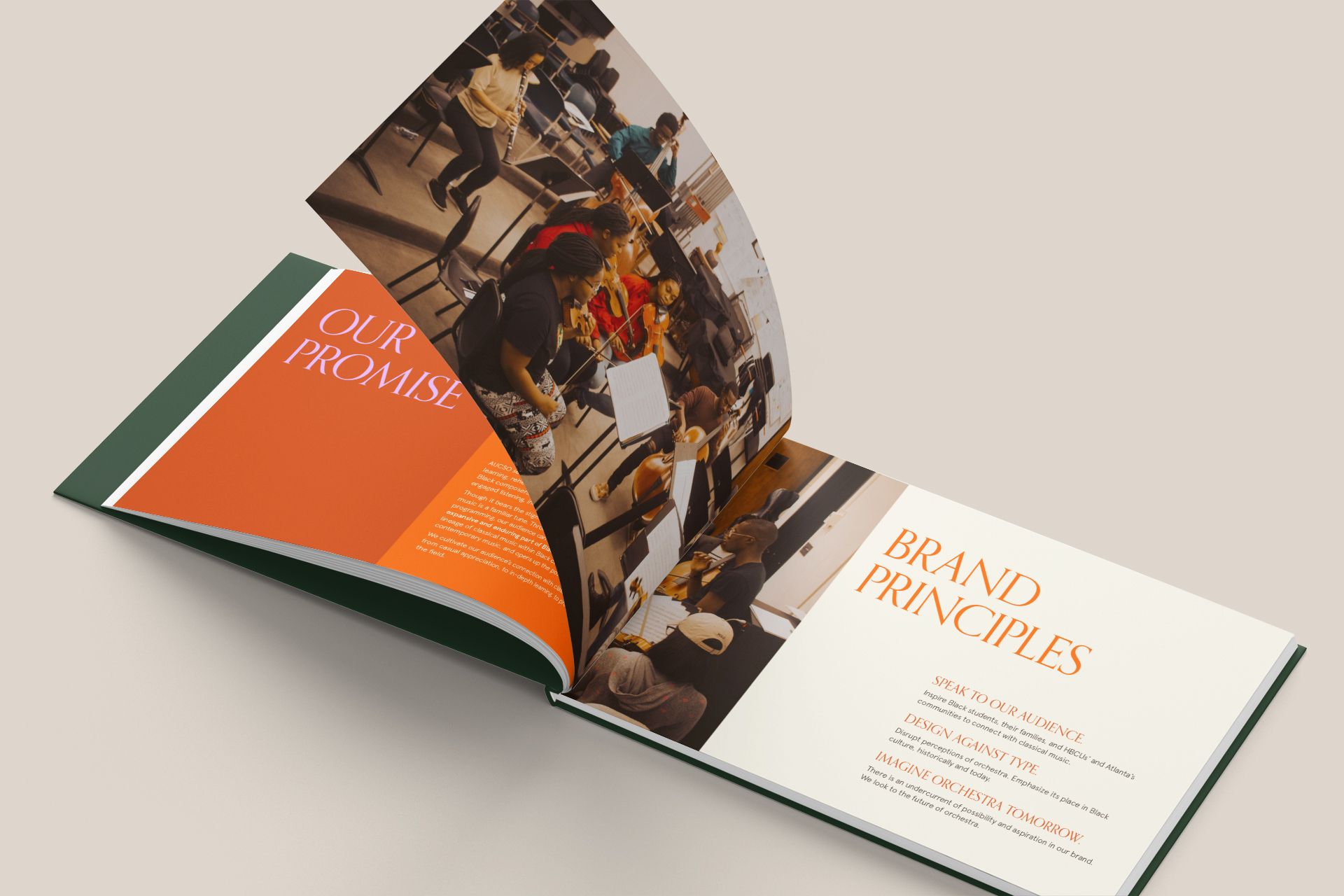
The Atlanta University Center-wide Symphony Orchestra (AUCSO) centralizes music learning, rehearsal, and performance for the Atlanta University Center Consortium (AUCC).
Through its programming, AUCSO traces the lineage of classical music in Black culture and explores musical innovation in orchestra today. It invites students, and the Black community at large, to see themselves the past, present, and future of classical.
AUCSO sought a visual identity to unify its programs across multiple HBCU campuses and to express its diverse and lively vision of orchestra.
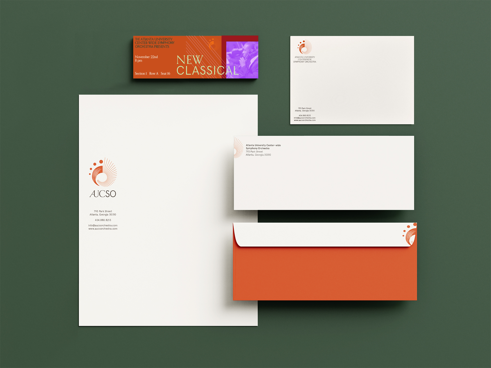
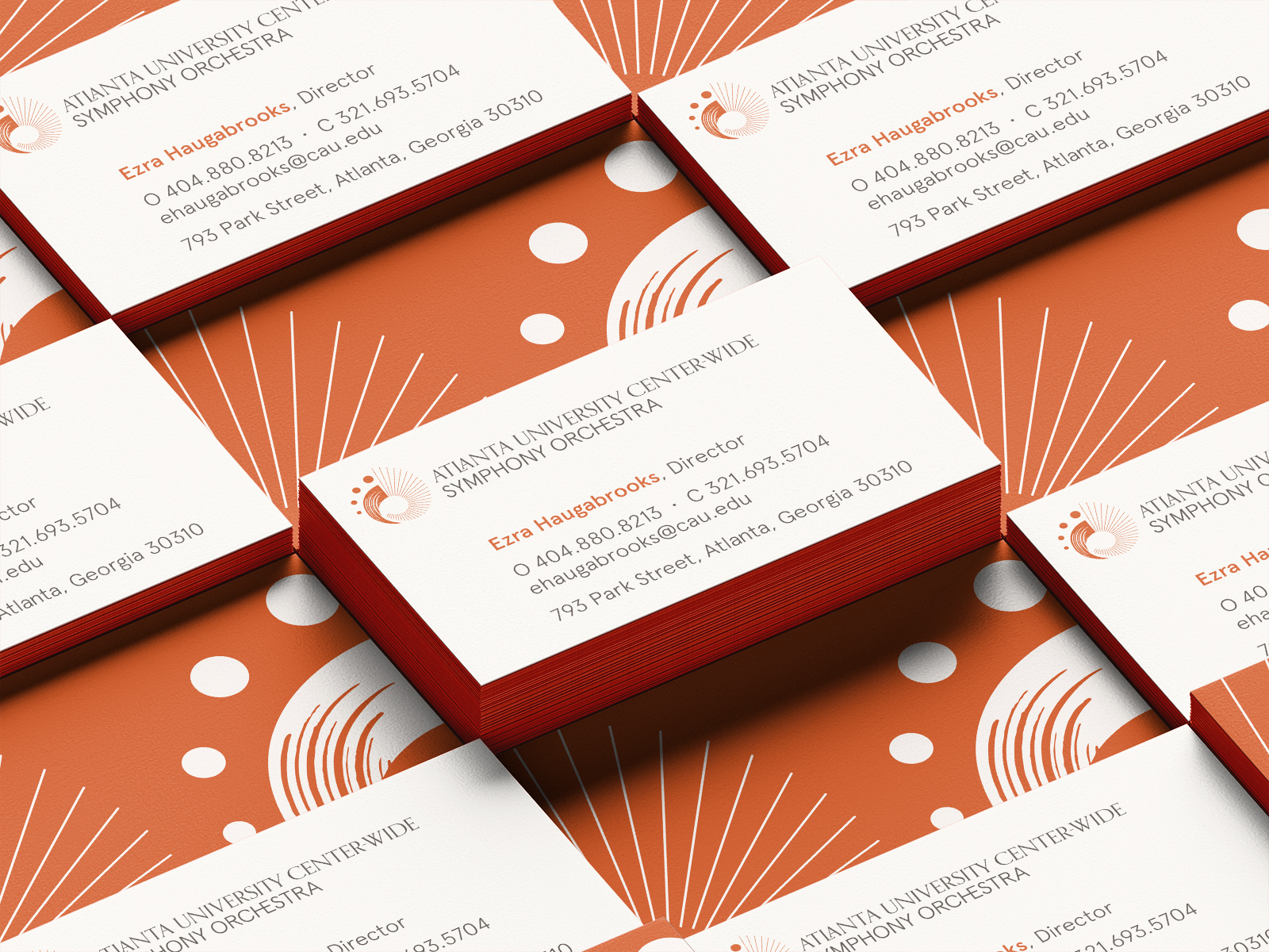
Designed for tomorrow’s orchestra
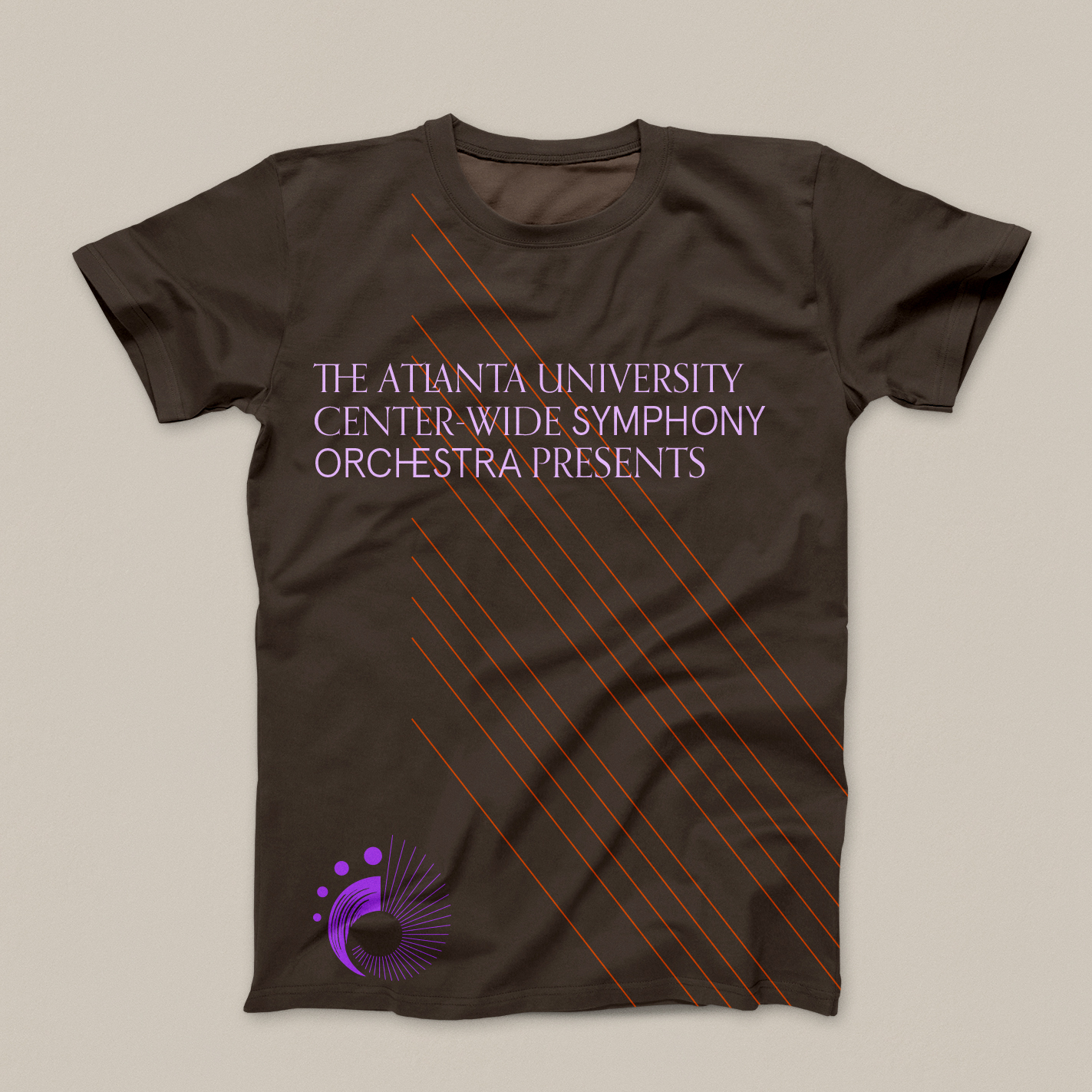
Like AUCSO, the logo represents orchestral music as inclusive, dynamic, and vital.
The fine lines allude to musical notation and practice. The brush stroke energizes the mark. The four dots stand for the AUCC and city of Atlanta.
The logo spirals toward and away—just as AUCSO dives into both the history and future of orchestral music.
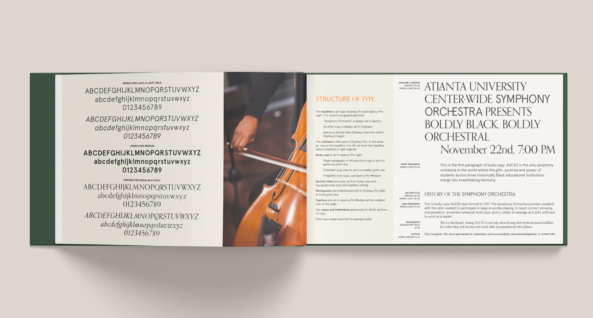
Orpheus Pro has a classical look, while Apercu Pro feels fresh and contemporary. The two together spark a double-take—a reconsideration of assumptions.
By harmonizing opposing elements, the logo reflects AUCSO’s interrogation of what orchestra truly is.
Like AUCSO, the identity design destabilizes assumptions about classical music. It takes inspiration from AUCSO’s mission to foster connections between historic and contemporary Black music and culture.
As part of a university colloquium, the brand balances intellectual rigor with curiosity. This comes through in every aspect of the identity system.
The typography is inspired by code-switching, or moving between social modes and languages.
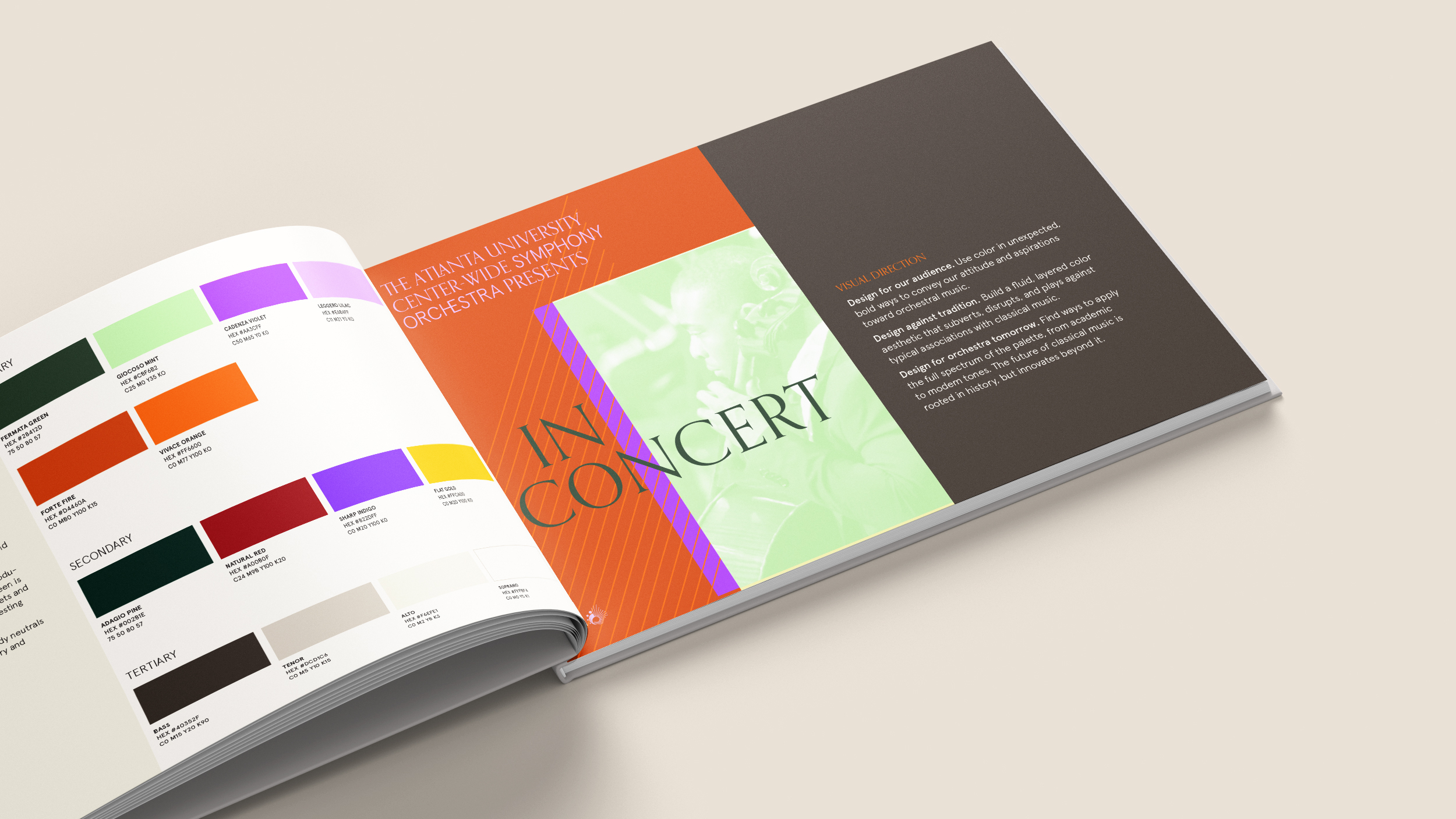
The color scheme is academic and electric. The guiding principle is color overload—immersive, bold swathes of color that celebrate music.


The brand style guide anticipates collaborative partnerships between AUCSO and many creatives. It outlines principles that invite different perspectives into design projects, while maintaining the integrity of the brand.
AUCSO’s website was developed by Profound Pixels based on the guide and the brand’s visual elements.
