A catalogue for seeing (and knowing) the work of Kennedy Yanko at UICA
Client: Kennedy Yanko, artist, and UICA, Grand Rapids, MI
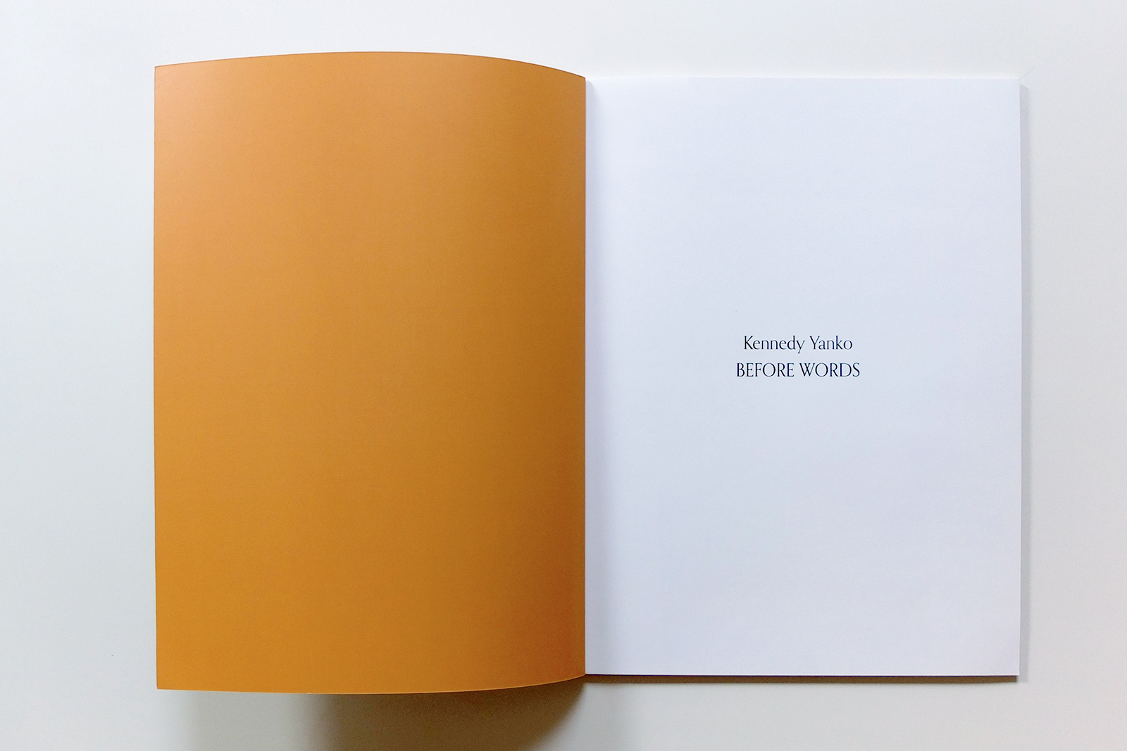
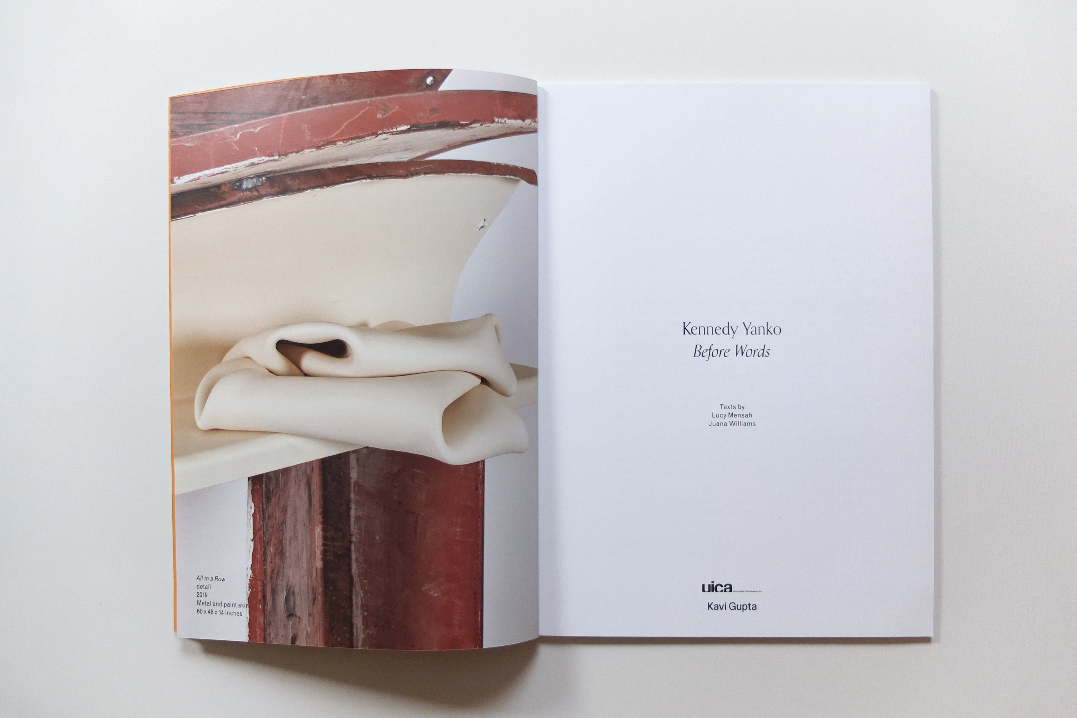
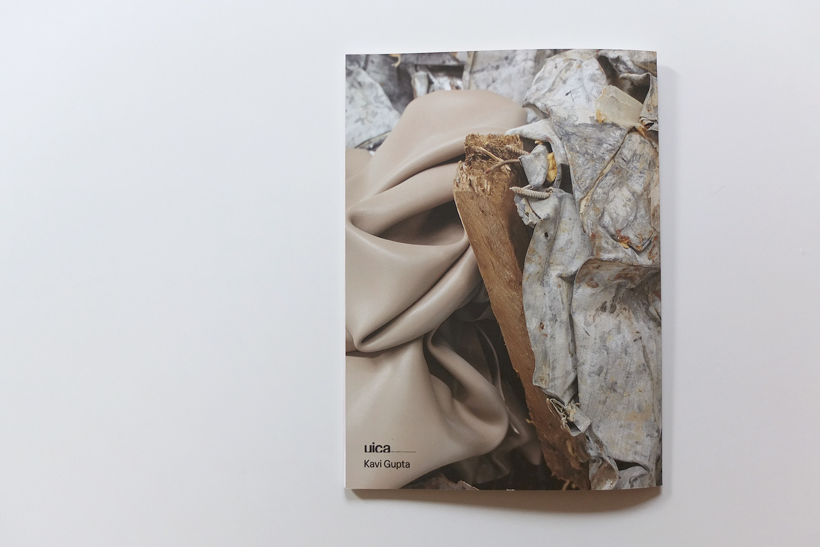
Kennedy Yanko: Before Words. Contributions by Lucy Mensah, Juana Williams, and Kennedy Yanko. Published by UICA and Kavi Gupta, 2019. Perfect bound softcover with velvet finish, 44 pages, 8.5 x 11 inches. Background image and exhibition text courtesy of UICA and the artist.
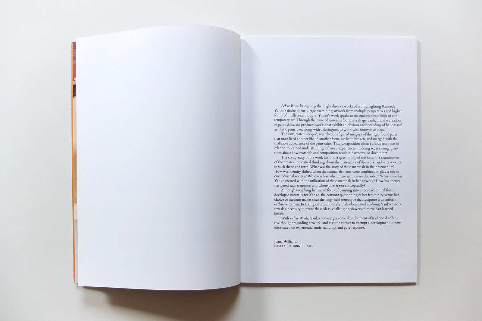
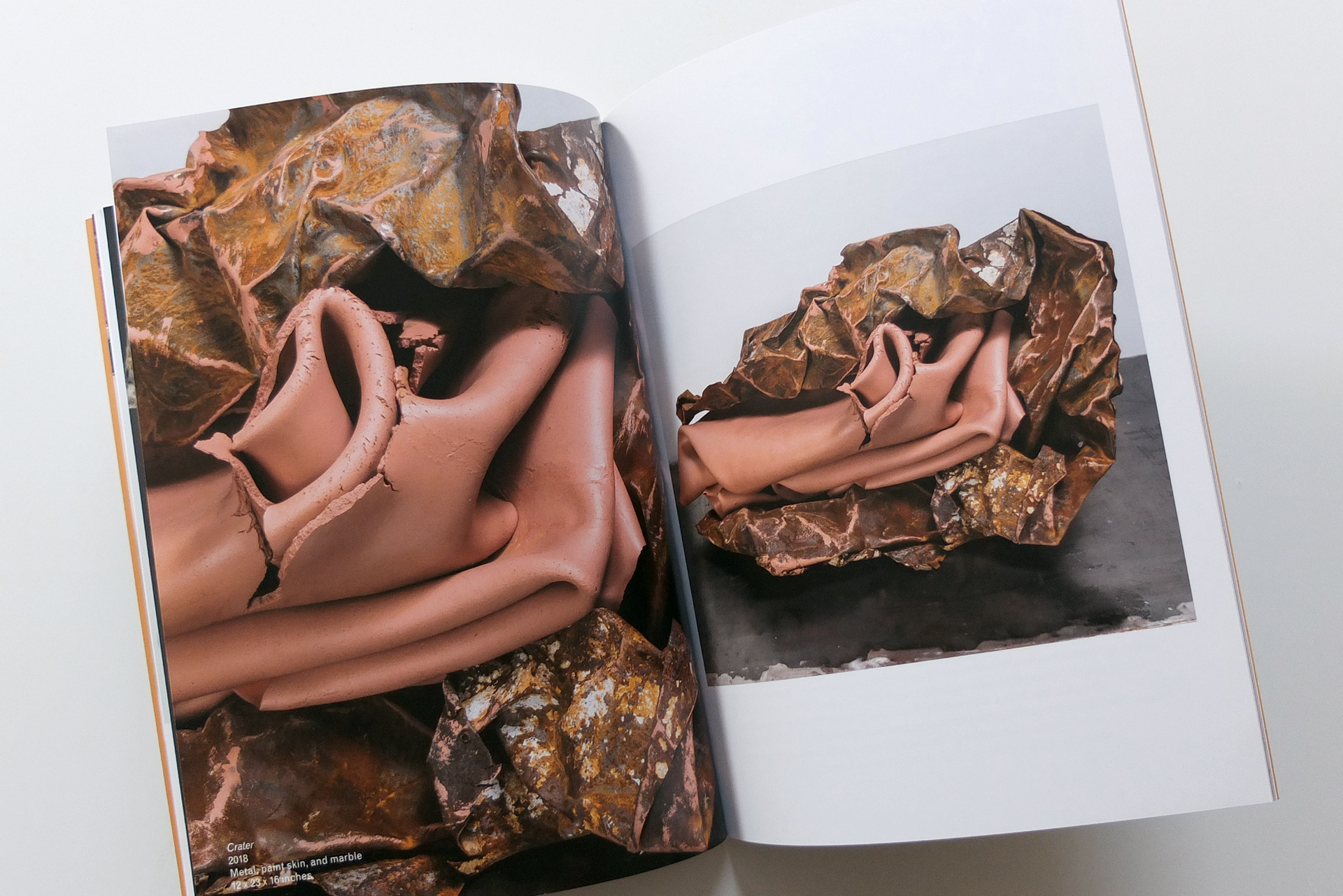
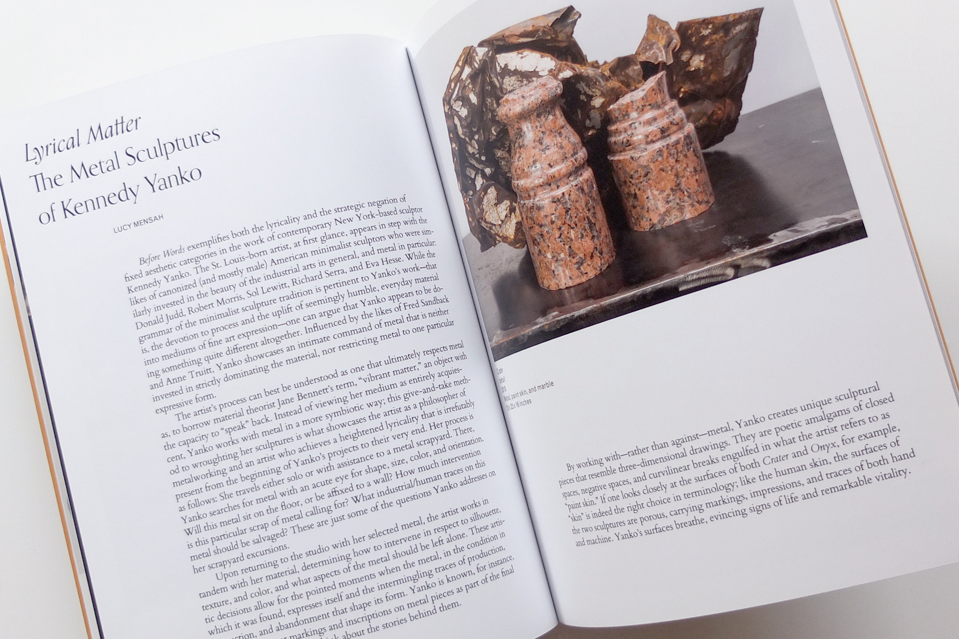
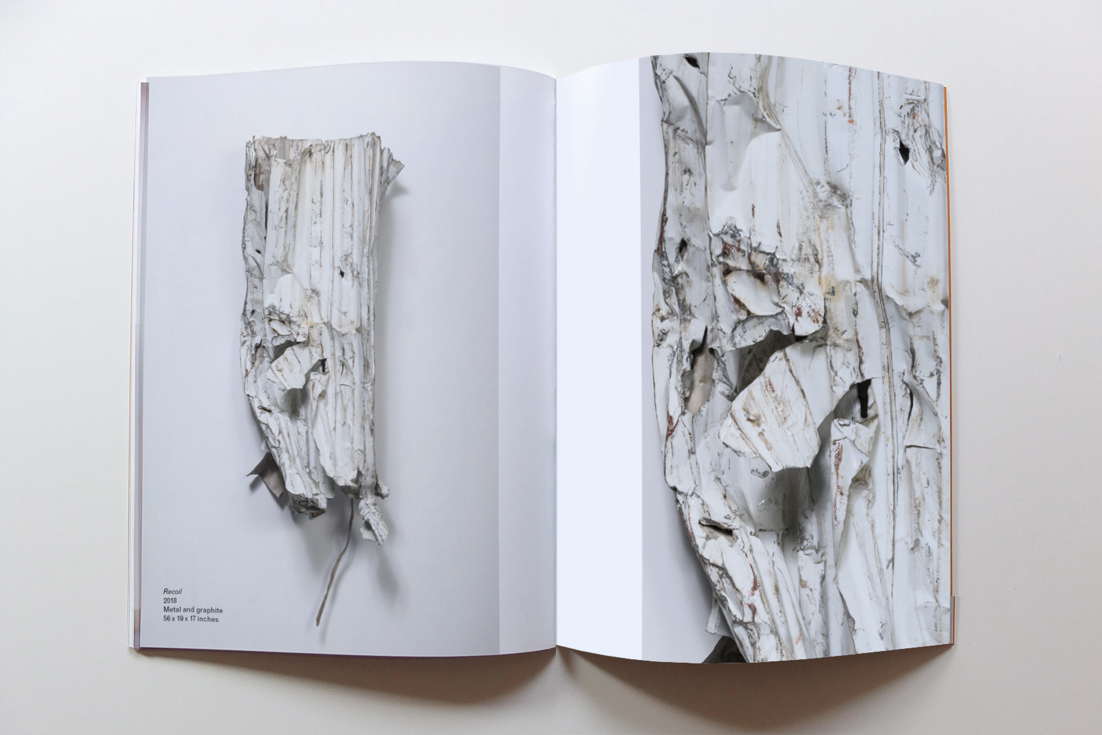
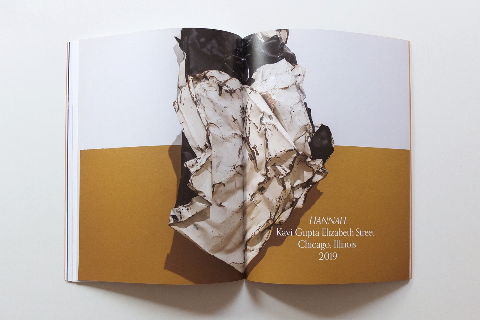
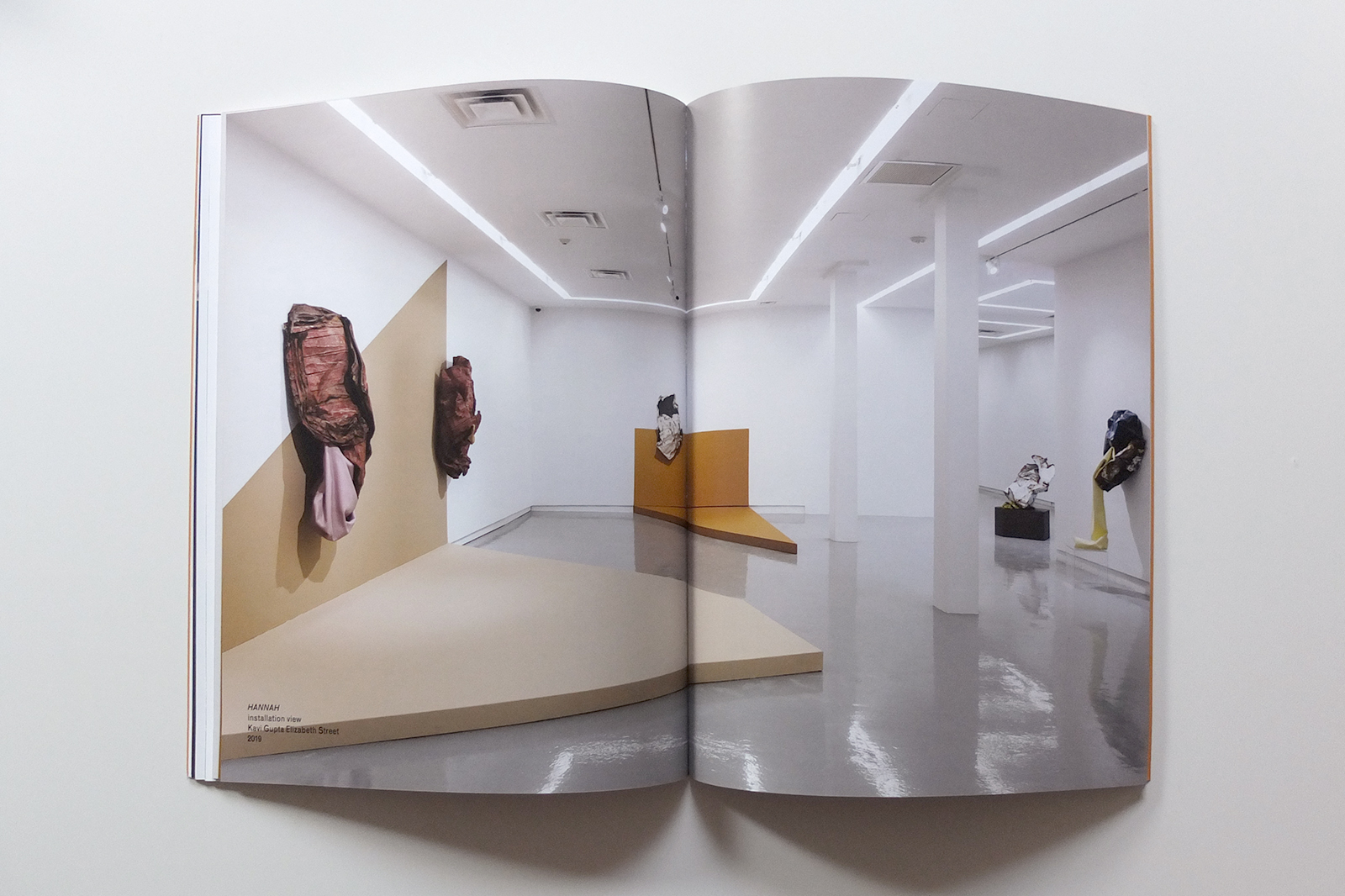
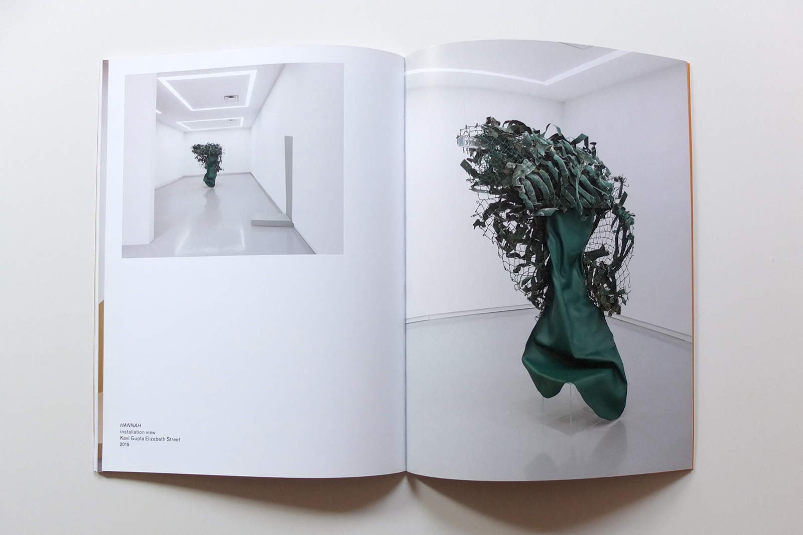
Before Words is a body of metal and paint skin works by Kennedy Yanko, exhibited at the Urban Institute for Contemporary Arts (UICA).
Yanko is a painter-sculptor of unexpected, lyrical compositions. With Before Words, Yanko posits that firsthand sensory experience is a means to critical thought, and ambiguity can elicit a vivid response.
The publication design subtly embraces the tactile and experiential, inviting the senses to participate in reading the artist’s work.
The touch of experience
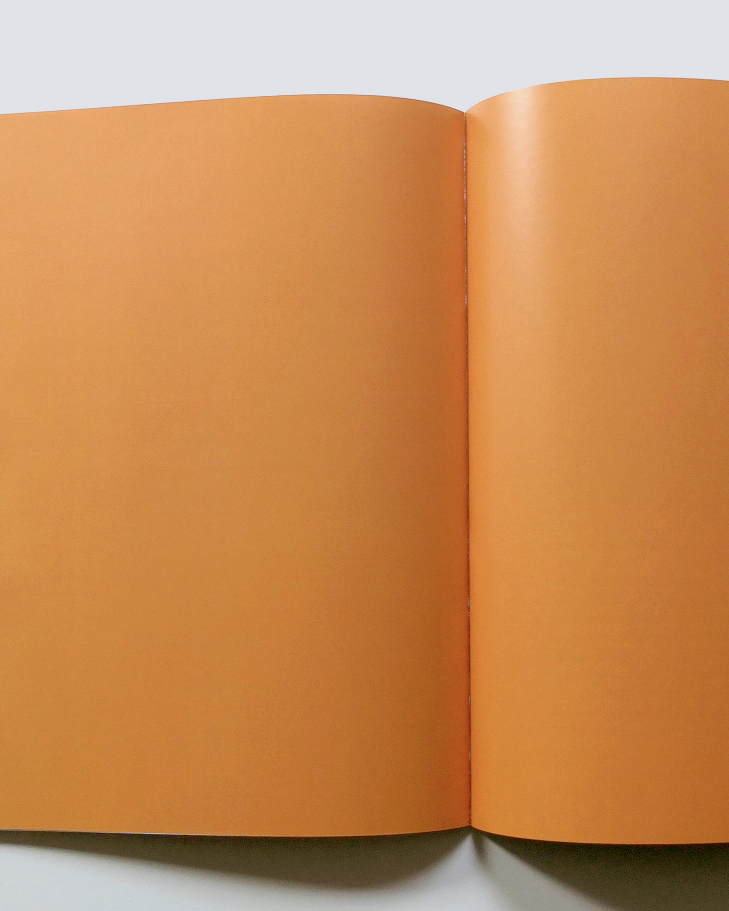
Yanko’s works speak to the reader through the publication design. The cover’s soft-touch finish evokes the supple paint skins in her work. The inside covers and spread dividing sections of the book are flooded with an earthy orange similar to the artist’s palette. The immersive color fields gesture toward abstraction and possibilities latent in raw material.

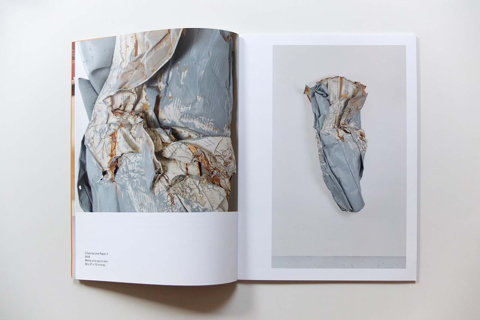
Yanko’s work embraces contradiction—delicate lines in hard metal; thick paint as sculpture; scrap as fine art.
To match the lyricism and unexpected congruities in her work, the book is typeset in Orpheus Pro, a precise yet flowing typeface; Cardo, a classical serif; and Grotesque MT, an industrial sans serif.
The layouts are rhythmic and varied to convey the experience of encountering Yanko’s work.